Creating a Configuration
The core of AppColab Grid is its powerful configuration engine. You can create tailored grid views for any object without writing a single line of code.
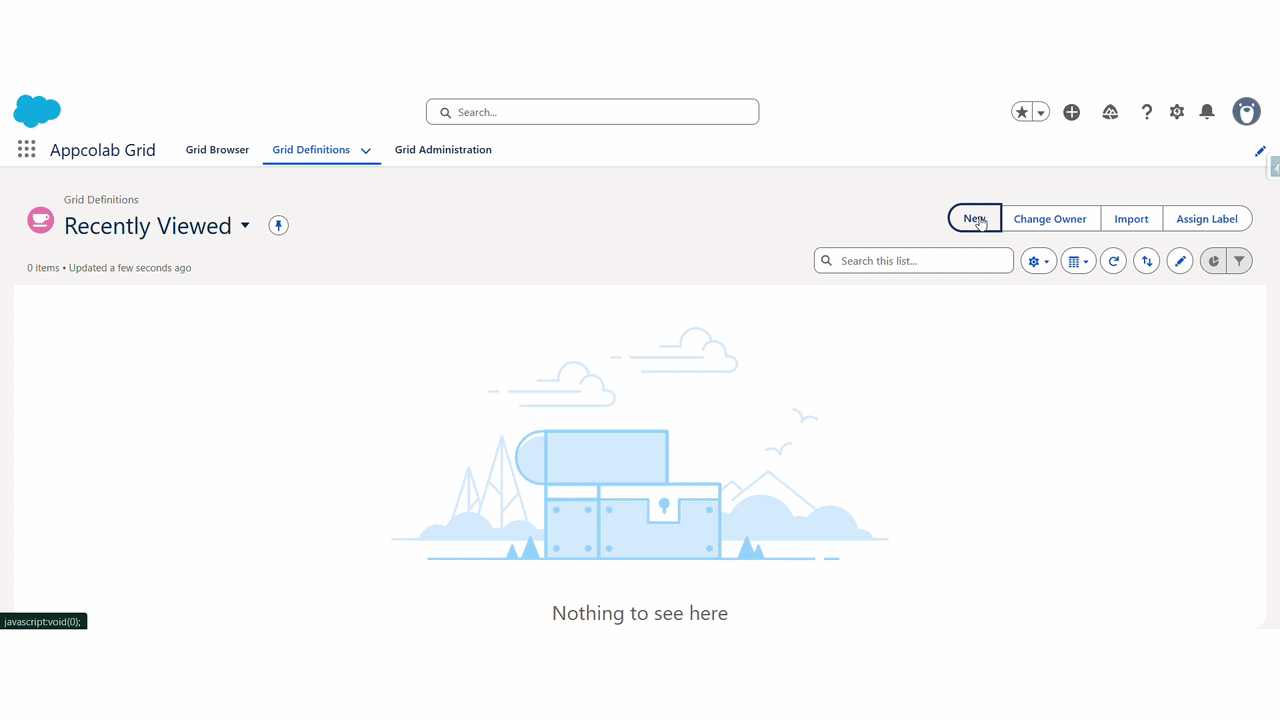
To get started, navigate to the Grid Definitions tab in Salesforce, or click the + New Grid button from the Grid Browser tab.
Step 1: Grid Details
The first step defines the basic properties of your grid.
- Name: A unique identifier for your grid configuration (e.g.,
Account_Active_Grid). - Label: The user-facing title of the grid.
- Default Page Size: Number of records to show per page (e.g., 10, 25, 50).
- Record Limit: The maximum number of records to retrieve (default is 1000).
- Row Selection Mode: Choose
None,Single-Select, orMulti-Select. - Parent Relationship Field: The specific API name of the lookup field used to map and filter related records if this grid is nested as a child grid.
- Frozen Column Count: Number of left-most columns to keep fixed while scrolling horizontally.
- Pagination Type:
Auto: Uses client-side for small datasets and server-side for large datasets.Client-Side: Loads all matching records up to the Record Limit at once.Server-Side: Fetches one page at a time directly from Salesforce (best for massive datasets).
- Enable Features: Toggle granular toolbar actions:
- Edit Mode, Add Row, Delete, Search, Filter, Column Settings, Sort, Refresh, Reset Grid, Clone Records, Download CSV, Undo/Redo.
- Enable Row Actions: Manage per-row actions available to the user:
- View Record, Edit Record, Delete Record, Show Files.
Step 2: Objects & Columns
Select the data you want to display.
- Primary Object: Search for and select the main Salesforce object (e.g.,
Contact). - Add Fields: Use the field search to find fields. Click to add them to your selected columns.
- Related Fields: You can deeply traverse relationships! You can navigate lookup relationships up to 5 levels deep to fetch parent context (e.g.,
Contact > Account > Owner > Manager > Name). - Reorder: Drag and drop the selected fields to change the column order.
- Edit Formats & Overrides: Click the pencil icon on a selected field to access the Field Editor:
- Rename: Change the column label.
- Field Type Override: Override standard datatypes to complex components natively using
Override Type. For example, display text dynamically as an interactive Mini Chart, render raw text to a clickable URL, or enforce a static Picklist onto a standard string field. - Conditional Highlighting Rules: Build advanced rules directly in the columns to dynamically highlight rows or specific cells conditionally based on row values (e.g., if Amount > 50000, highlight cell green).
Step 3: Filter
Define which records should appear in the grid by default.
- Field: Choose a field to filter on.
- Operator: Select
Equals,Contains,Starts With,Greater Than, etc. - Value: Enter the value to match.
- Logic: If you add multiple filters, you can define the logic (e.g.,
1 AND 2or1 OR 2).
Step 4: Action Details
Add custom interactivity to your grid.
- New Action: Click to define a new action.
- Action Type:
Flow: Launch a Screen Flow.Apex: Execute an Apex method.URL: Navigate to a web page or standard record page.
- Location:
Top: Appears as a button above the grid.Row: Appears in the action menu for each row.
Step 5: Child Grids
Show related data in a hierarchical view. If you have another Grid Configuration (e.g., for Cases), you can nest it here.
- Child Config: Select an existing Grid Configuration.
- Label: The tab name for the child grid.
- The system automatically handles the relationship mapping (e.g., showing Cases related to the current Account).
[PLACEHOLDER FOR GIF: CHILD GRID CONFIGURATION]
Step 6: Preview
Verify your configuration with real data. This step shows you exactly how the grid will look to end-users.
Once satisfied, click Finish to save your configuration.