Grid Tour
A quick tour of the parts of an open grid, so you can find what you need before diving into the detailed pages.
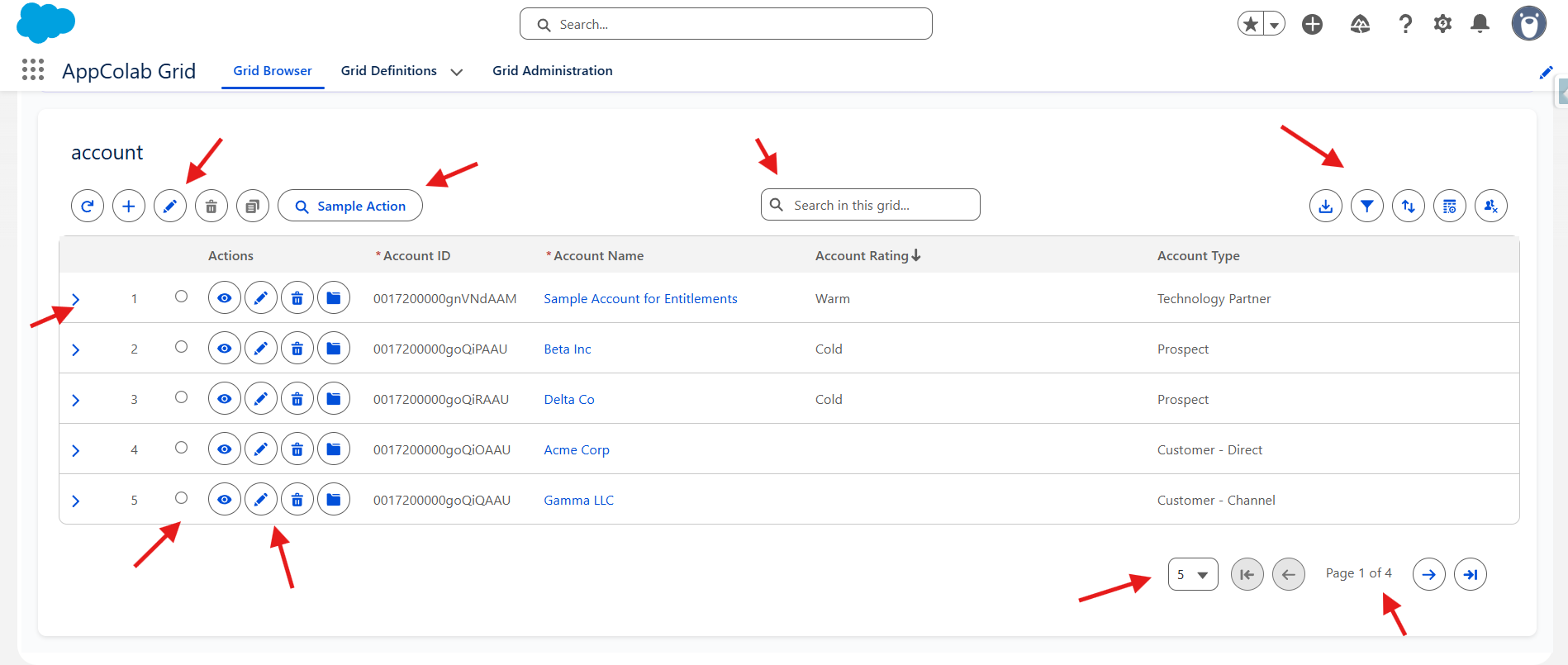
Anatomy of a grid
From left to right and top to bottom:
- Toolbar (top left) — action buttons: Refresh, Add Row, Edit Mode / Save / Cancel, Undo / Redo, Delete, Clone, and any custom toolbar actions configured by your admin.
- Search bar (toolbar center) — global text search across visible columns.
- Toolbar (top right) — utility buttons: Download CSV, Filter, Sort, Column Settings, Reset Grid.
- Column headers — click to sort by that column. Drag the resize handle on the right edge of a header to resize the column; double-click it to auto-fit. Multi-sort is supported (see Searching, Filtering & Sorting).
- Expand chevron (
>) — far-left column — appears when the grid has a child grid. Click to show related records for that row. - Row number column — shows the row number and an error icon if that row has a save error.
- Selection column — checkboxes (Multi-Select mode) or radio buttons (Single-Select mode) for selecting rows.
- Row actions — View, Edit, Delete, Show Files, or custom actions — appear as small icon buttons on the left side of each row (after the selection column).
- Cells — click in Edit Mode to edit; certain cells may render as charts, progress bars, or clickable links depending on how the admin configured the column.
- Pagination (bottom) — page-size selector, first/previous/next/last buttons, and a page counter. In Edit Mode, Save and Cancel buttons also appear here.
Common tasks
Find the right how-to page:
| I want to… | Go to |
|---|---|
| Find a record quickly | Searching, Filtering & Sorting |
| Edit one or many records | Inline Editing |
| See related records under a row | Child Grids (user view) |
| Change which columns I see, or reorder them | Personalizing Your View |
| Export the data to Excel | Exporting Data |
| Take an action on one or many records | Custom Actions (below) |
Actions and custom actions
Actions are the buttons your admin has made available on this specific grid. They fall into two groups:
Row actions (per record)
Appear as a small group of icon buttons on the left side of each row. Typical row actions:
- View — open the standard record page.
- Edit — open the standard Salesforce record edit modal.
- Delete — delete the record (with confirmation).
- Show Files — manage the record’s Files/Attachments.
- Custom actions — Flow, Apex, or URL actions configured by your admin.
Toolbar actions (one or many records)
Appear at the top of the grid and typically require you to select one or more rows first via the checkboxes. Typical toolbar actions:
- Mass Delete — delete all selected records.
- Custom Flow — open a guided screen flow with the selected records in context.
- Custom Apex — run a background operation against all selected records.
- Custom URL — navigate somewhere with the row’s data in the link.
If a button is greyed out, it usually means you have not selected any rows yet.
Refreshing data
- Click the refresh icon in the toolbar to re-query Salesforce for the latest data.
- After saving inline edits, the grid refreshes automatically.
- After a custom action finishes, the grid refreshes automatically.