Columns & Fields
The Objects & Columns step is where you choose what data the grid shows: the primary object, the fields to display, and any per-column formatting.
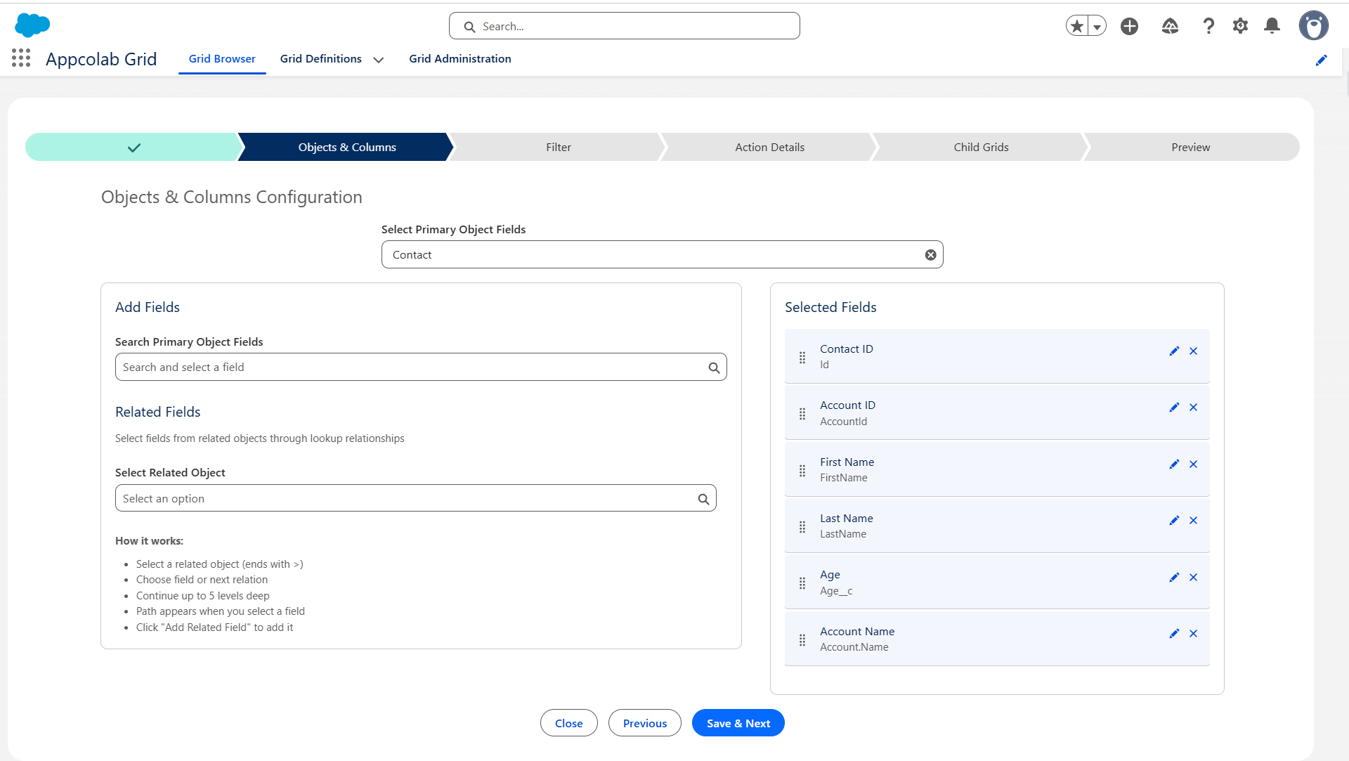
Choose the primary object
- In Primary Object, search for the object you want to show (standard or custom, for example
Contact,Account,Opportunity, or your ownMy_Object__c). - Select it.
You can only pick one primary object per grid. Related-object fields are added later as columns, not as a separate primary object.
Add fields as columns
Once the primary object is selected:
- Type a field name in the field search box, or browse the list.
- Click a field to add it to Selected Fields on the right.
- Drag selected fields up and down to change the column order in the grid.
- Click the X on a selected field to remove it.
Add related fields (up to 5 levels deep)
You can pull fields from parent records through lookup relationships — up to five levels of traversal.
- Click Add Related Field.
- Select the lookup to follow (for example, on Contact, select
Account). - Pick a field on the related object (for example,
Name). - Or continue traversing further —
Contact → Account → Owner → Manager → Nameis valid. - The resulting column uses the full path as its identifier and an auto-generated label you can change.
Use related fields to avoid building custom formula fields just to display parent context.
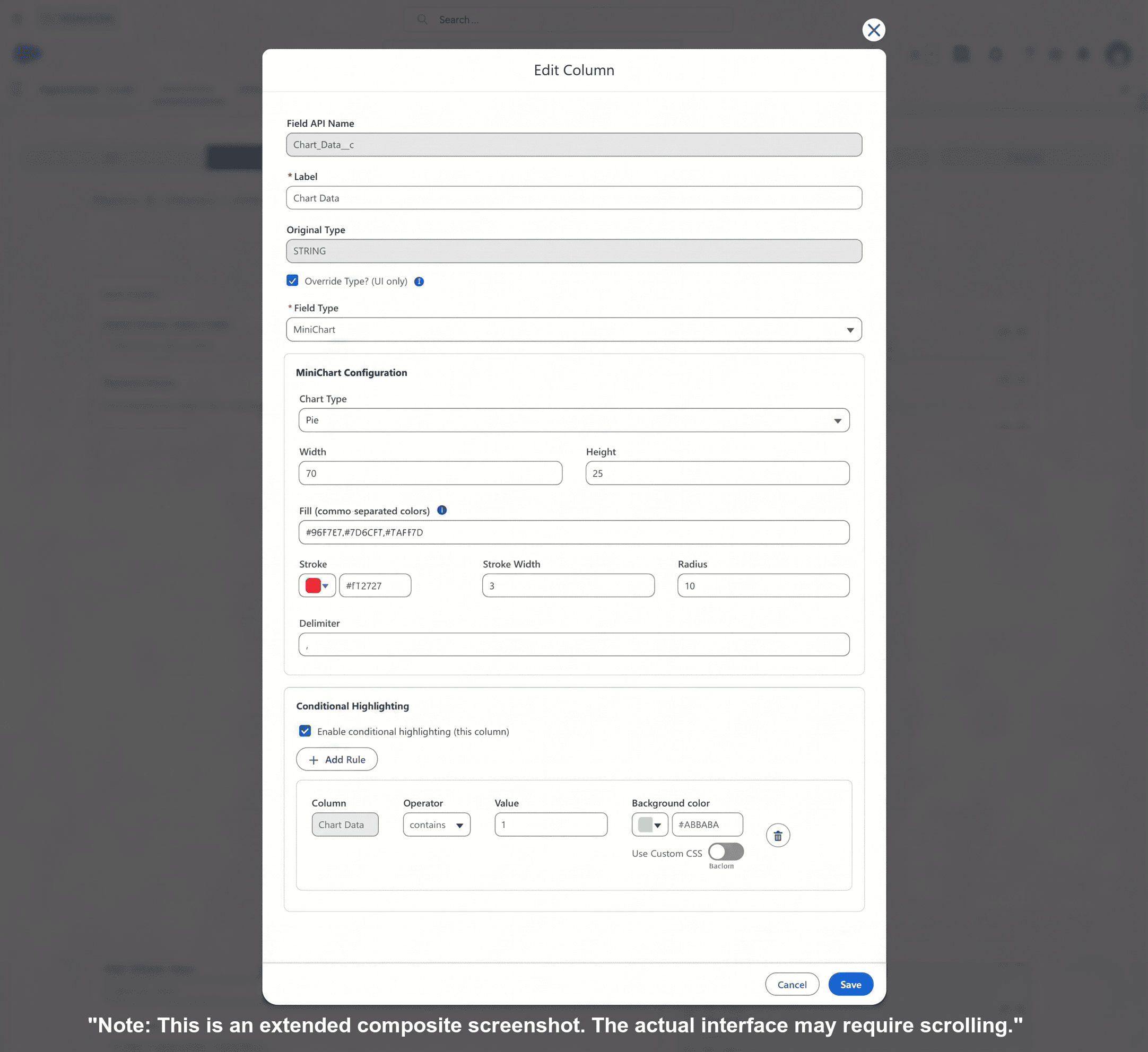
Edit a column (field overrides)
Click the pencil (edit) icon on a selected field to open the Field Editor modal. Here you can:
Rename the column
Set a user-friendly Label (for example, rename Account.Owner.Name to Account Owner).
Override the column type
By default each column renders using the underlying Salesforce field type. Override Type lets you display the value differently without changing the data model. The following three override types are fully supported:
| Override | Use when |
|---|---|
| Mini Chart | You have a numeric or comma-separated list of numbers and want an inline bar, line, pie, or donut chart (sparkline). |
| Reference | You have a text field containing record IDs and want to render it as a clickable Salesforce lookup link pointing to a target object. |
| Picklist | You have a standard text field and want to constrain input to a defined set of picklist labels and values during inline editing. |
Overrides are most reliable when the underlying data matches the target type (for example, numeric data for Mini Chart). Complex overrides on formulas may have limited editing support.
Add conditional highlighting rules
Conditional highlighting lets you color a cell — or the whole row — based on the record’s values.
- In the Field Editor, open Conditional Highlighting Rules.
- Click Add Rule.
- Pick a field, operator, and value (for example,
Amount > 50000). - Choose a color/style for the cell (for example, green background).
- Save.
Rules evaluate against each row at render time. Multiple rules are evaluated in order.
Which fields are editable?
A field in the grid is editable inline when:
- Inline Edit Mode is enabled for the grid (see Grid Details).
- The user has Field-Level Security edit access to the field.
- The underlying field is not read-only (formula, rollup, system-managed).
- The override type supports editing (for example, Mini Chart displays a value but is not directly editable).
Fields that cannot be edited will appear read-only even in Edit Mode.
Recommendations
- Show the fewest columns users actually need. You can add more later via Column Settings at the user level.
- Prefer related fields over custom formulas for showing parent context — it keeps the data model clean.
- Use conditional highlighting sparingly; a few rules per grid is more useful than dozens.
- Rename related-field labels to something human-readable (for example,
Account Ownerinstead ofAccount.Owner.Name).